Renowned furniture designer John Houshmand has done it again with the coffee table from his latest collection, Shazam. The loose organic feel of the wood combined with the precise manufactured styling of the glass creates an ideal Yin and Yang harmony that I would love to have in my living room.
Tuesday, May 31, 2011
Friday, May 27, 2011
Espresso With a Twist
Although a little dizzying, Madison Avenue coffee bar D’espresso is certainly one of a kind. The walls are covered in herringbone flooring and a bookshelf wallpaper while the lights protrude from the wall instead of the ceiling, all adding to the illusion that shop is flipped on its side…test it out yourself by tilting your head to the right!
Thursday, May 26, 2011
Inside Out
Who said that outdoor furniture could only be made of wicker or teak? Bringing a few of your indoor pieces outside is a great unexpected touch to make your yard feel cozy and enjoyable.
Wednesday, May 25, 2011
Architectural Digest
One of my favorite traits about Architectural Digest is that they include floor plans for a lot of their featured projects. It paints a far more complete picture about the relationship of spaces than photos alone. Here are 10,000 square feet of minimalist beauty in Santa Fe by Architect Stephen Bucchieri. The art gallery was placed so the sun reaches its center skylight at exactly solar noon, and the owner’s wife says you can sit on the floor and literally watch the earth move around you. Pretty fabulous.
Tuesday, May 24, 2011
A Unique Find
This built-in chaise lounge caught my attention as an interesting way of saving space in a small room. The large bay window beside it makes this space a perfect modern reading nook.
Monday, May 23, 2011
Fun Fixtures
The first thing that drew me to these images was the chandeliers. As I began reading about the Los Angeles home, I learned that the chandeliers were the first purchase the owners made for their rustic abode and I certainly cannot blame them. The hanging fixtures are such unique and beautiful finds and you can’t help but imagine the life they had before landing here. Almost all of the furniture in the home was gathered from friends, flea markets, and thrift shops and the result is a distinct and comfortable space that begs to tell a new story all its own.
Thursday, May 19, 2011
Christina Murphy
Although I had seen her work in various places before, I came across the official portfolio of New York based interior designer Christina Murphy for the first time yesterday. Her bold use of patterns, colors, and textures has understandably put in her high demand with clients who aren’t afraid of making a loud statement. You can’t help but feel a bit of an energy boost from her designs.
Wednesday, May 18, 2011
Tuesday, May 17, 2011
Natural Beauty
Although this bathroom is exceedingly neutral in color, it is far from plain. The large stone piece behind the bathtub is such a unique and tasteful element and I love that it has been repeated in the backsplash for the sinks on the other side of the wall.
Monday, May 16, 2011
Playful Sophistication
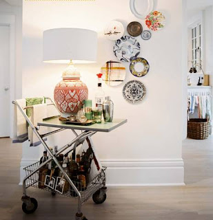
There are many refreshing elements about this home featured in the latest edition of Lonny Magazine. It is bright but not overstated and sophisticated yet still family friendly. The neutral flooring and walls allow for a variety of color and pattern play in the softer elements. I particularly love the vintage laundry cart that has been restored and repurposed as a bar.
Friday, May 13, 2011
A Kid in a Candy Store
My love for all things Anthropologie has run deep for quite some time now so I practically jumped for joy when I read that they were expanding their presence in interior decorating. They will open in-house design centers called decorator concepts in twelve Anthropologie stores across the U.S. and U.K. (check online to see a list of all locations). No need to be heartbroken if a decorator concept isn’t opening near you, they will be launching a new section of their website offering similar services for online shoppers that include wallpaper calculators and swatch request forms. In-store services will include expert advice, workshop styles classes, and a wide variety of products available for purchase. I can’t wait!
Wednesday, May 11, 2011
Library Ladders
Whether purely ornamental or actually used for hard to reach areas, a ladder is a great addition to a room with high ceilings.
Tuesday, May 10, 2011
Beaming
I love what a simple addition like these worn exposed beams can add to a space without overdoing it.
Monday, May 9, 2011
Exciting Eclecticism
This Dallas residence is a perfect example of eclecticism. The vivid color palette, antique furniture, and bright airy rooms blend seamlessly together to create this truly one of a kind dream home.
Friday, May 6, 2011
Beach Sophistication
The new Hilton Pattaya hotel in Thailand is here to offer a refreshing take on beachside resort design. The wavy ceiling formations were created with rippling fabric fins that sway softly and are reminiscent of the movement of the ocean without being obnoxiously “themey”. A similar subtle suggestion is made through the neutral palette that evokes a feeling of sand. The Pattaya has truly raised the bar for beach resort sophistication.
Thursday, May 5, 2011
Dream Closets
Whether they are meticulously sorted by style and color or left a little messy, these are all great closet inspirations. I love the idea of a center island or table to lay out outfit combinations and display fresh flowers. A chandelier adds flair and an upholstered stool or chair provides the perfect place to put on your shoes and make the space feel more like a room and less like a storage compartment.
Wednesday, May 4, 2011
Subscribe to:
Comments (Atom)


