This New Zealand residence is a great example of what a lake house should be. It takes full advantage of the wonderful views, opening itself to the outdoors as often as possible. The color palette has been drawn from the surrounding nature, helping it to blend from outdoors to indoors seamlessly.
Thursday, June 30, 2011
Wednesday, June 29, 2011
The Bootstrap Project
While browsing the web a few days ago, I came across an amazing organization called The Bootstrap Project. Their goal is to preserve ancient crafts created by artisans in poverty stricken communities by providing them with a sustainable platform to promote their work. The profit from the sales goes back to the artists and their communities to provide them with education, help them end their own poverty, and preserve their beautiful crafts. Check out some of the amazing handmade pieces they have available below, and on their website.
Tuesday, June 28, 2011
Stairway to Heaven
Whether straight or curved, traditional or modern, utilitarian or for show, a staircase is a huge design feature in your home…let it make a statement that speaks to your style.
Monday, June 27, 2011
From Horse to Home
I am always impressed by a good conversion. These former stables have been transformed into a magnificent home with large windows that allow light to pour through the space. Although its purpose has completely changed, the rustic feel of the property has remained intact.
Friday, June 24, 2011
Thursday, June 23, 2011
A Gray Sort of Day
Gray is not usually a color that comes to mind when we think of making a statement, but these designs by Luisa Olazábal pull it off with a high level of sophistication. The muted color palette creates a soothing environment that is kept lively with the pops of purple.
Wednesday, June 22, 2011
An Added Touch
These lotus pendant chandeliers are the perfect delicate addition to this casual yet glamorous dining room, proving the importance of lighting when completing a space.
Tuesday, June 21, 2011
Kid Chic
A child’s room should always be fun and youthful, but that doesn’t mean that it needs to lack in design appeal. Here are some great examples of kid's rooms that incorporate playful patterns and elements while keeping a stylish edge for users of all ages to enjoy.
Monday, June 20, 2011
Quirky Kitchen
Kitchens are often a place that people prefer to play is safe, which is why I love seeing the occasional unexpectedly quirky kitchen design.
Friday, June 17, 2011
Bachelor Pad
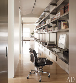
The phrase "bachelor pad" has a tendency to conjugate a mental image of empty pizza boxes, dirty clothes sprawled across a dirty floor, and old sports equipment doubling as decorative elements. This Tribeca penthouse on the other hand, is a picture perfect embodiment of what a real bachelor pad should be. It is streamlined, strong, and sophisticated; a masculine masterpiece. The airplane painting in the first image adds innocent charm while the hanging bed backed by the glass enclosed tub is very flirtatious; the combination makes this a quintessential prototype for bachelor homes worldwide.
Thursday, June 16, 2011
Lindsey Adelman Lighting
New York based industrial designer Lindsey Adelman has made a name for herself with these amazing raw yet defined lighting fixtures. It is fixtures like this that reminds us what an important effect lighting can have on a room. In Adelman’s own words, “I like the idea of transforming a space in a dramatic way through lighting,” she said, noting that much of her work is “about creating a mood and beauty, and people looking great at your dinner party”, and what could be more important than that!
Wednesday, June 15, 2011
London's Latest
For those lucky enough to travel to England in the near future, here is the hotel for you. The Corinthia London is an extremely sophisticated hotel with an even more desirable location. On top of its views of the River Thames it is also within a few minutes of landmarks such as the Royal Opera House, Big Ben, and the London Eye. With such spectacular views both inside and out, it is hard to imagine why you would ever leave.
Tuesday, June 14, 2011
Thursday, June 9, 2011
Detailed Designing
Attention to detail is one of the key factors in making a house a home. It is no surprise that this detail orientated abode belongs to a successful graphic designer who has meticulously ornamented every nook and cranny with the same attention to detail that she puts into her business each day.
Great Scale
The grand scale of this living room provides the perfect amount of sophistication to an otherwise casual and rustic space.
Subscribe to:
Comments (Atom)


